Please note this is early documentation, so the explanations, instructions, or formatting might not be fully refined. If you encounter any difficulties, feel free to contact me for guidance.

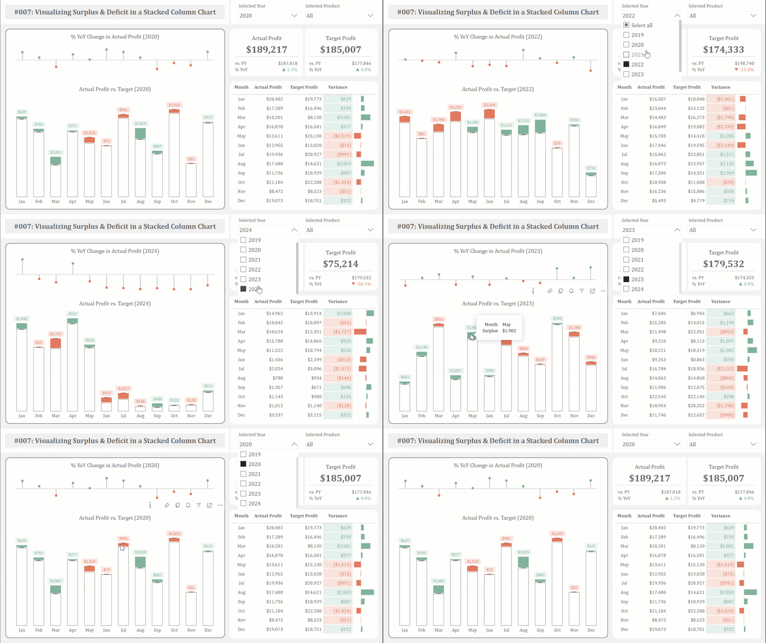
This article presents an alternative method for visualizing actual performance against target values. By leveraging the native stacked column chart in Power BI, we can effectively highlight the magnitude of monthly surpluses and deficits, enabling stakeholders to quickly grasp the performance variance.
‣
‣
Should you have any inquiries, specific requests, or feedback, please feel free to contact me through LinkedIn or email.
The .pbix files for free-access content are on my GitHub repository.
Unlock my exclusive documentation by becoming a member!
 Join Membership