
Please note this is early documentation, so the explanations, instructions, or formatting might not be fully refined. If you encounter any difficulties, feel free to contact me for guidance.
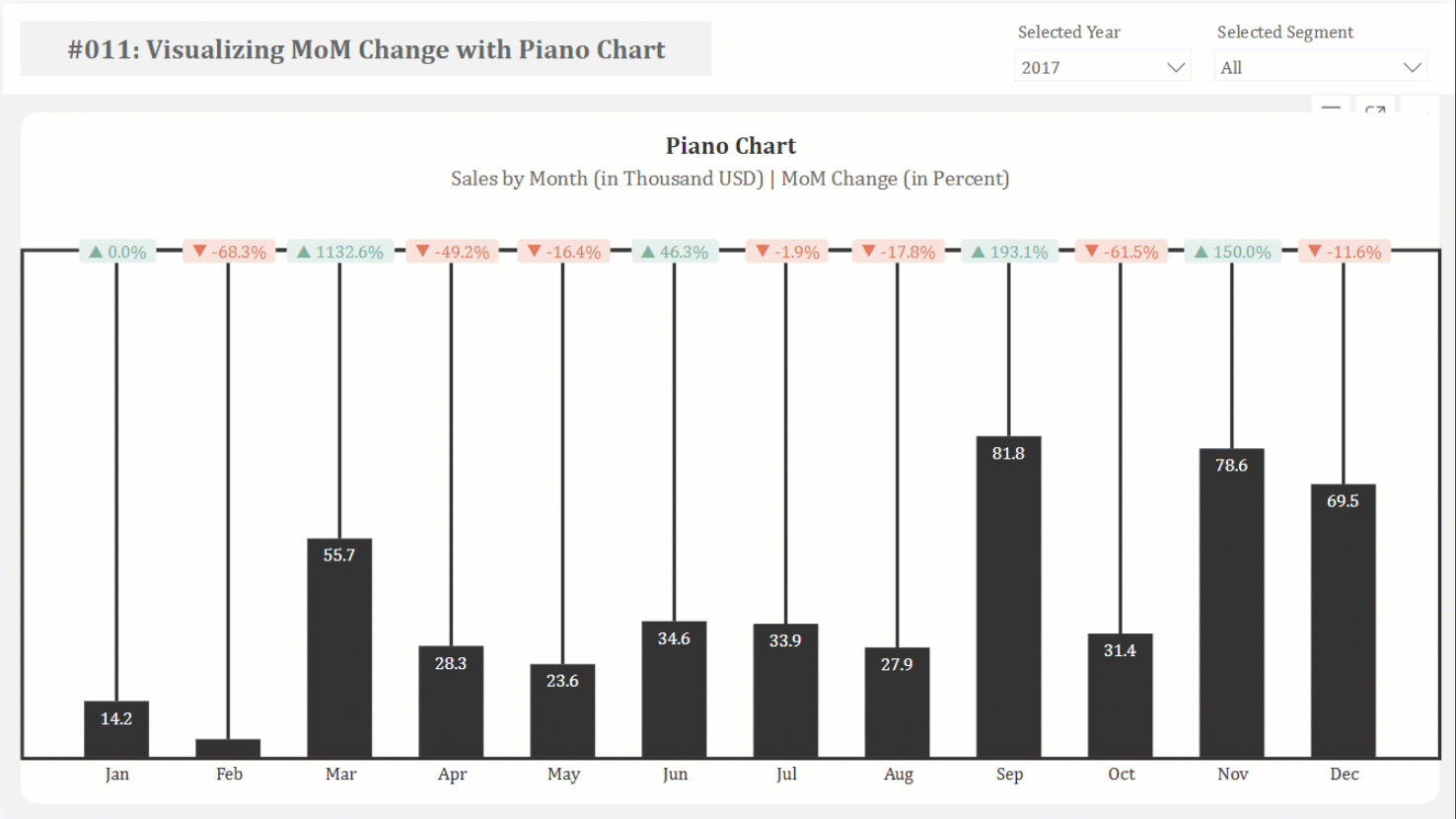
This article provides a step-by-step guide to replicating the “Piano” or “Delta” chart, a creative visualization for showing changes between two points in time, within Power BI. This chart, originally created in Tableau by Guido Jongbloed, is particularly effective for emphasizing percentage changes between months.
‣
‣
Should you have any inquiries, specific requests, or feedback, please feel free to contact me through LinkedIn or email.
The .pbix files for free-access content are on my GitHub repository.

Unlock my exclusive documentation by becoming a member!
 Join Membership