/w=3840,quality=90,fit=scale-down)
Please note this is early documentation, so the explanations, instructions, or formatting might not be fully refined. If you encounter any difficulties, feel free to contact me for guidance.

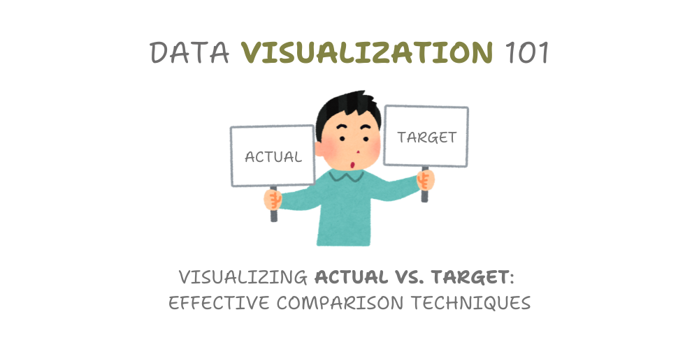
In this article, we’re going to look at different ways to show data about Dubai’s water-saving program. We’re starting with a chart from Statista that shows how much water Dubai planned to save each year from 2013 to 2022, and how much they actually saved. Our job is to create new charts using this same information. We want to find out which types of charts make it easiest for people to understand the data quickly. By trying out different chart styles, we’ll figure out the best way to present this information so it’s clear and easy to grasp.
Original article:
Foreword
We often use charts to compare the actual values with the targets. This article explores different ways to make these charts. Our goal is to find methods that reduce cognitive load — that is, how much mental effort people need to understand the information. We’ll look at various chart types and figure out which ones make it easiest for viewers to grasp the data quickly. By understanding these different visualization techniques, we can choose the best way to present our information. This helps ensure that anyone looking at our charts can understand the key points without having to think too hard or get confused.
What is Cognitive Load?
Cognitive load refers to the mental effort required to process information. When information is presented in a way that is complex, unfamiliar, or difficult to understand, it can increase cognitive load. This can make it harder to learn, remember, and apply information.

There are three main types of cognitive load and I’ll try to explain them briefly in the context of data visualization:
- Intrinsic: the complexity of the data itself and the insights you’re trying to convey.
- Extraneous: the unnecessary mental effort caused by poor design choices in your visualization.
- Germane: the mental effort that helps viewers understand and remember the insights from your data.
Cognitive load is basically how much your brain has to work to understand something or do a task. Think of your brain like a computer - it has a certain amount of processing power and memory. When you’re trying to learn something new or solve a problem, you’re using up some of that processing power and memory.
Case Study: Dubai Demand Side Management (DSM) Program

Water Saving Targets and Actual Water Savings Dubai 2013–2022 (source: statista)
Dubai has a program called Demand Side Management (DSM) that aims to save water. At first, in 2013, the program struggled and didn’t meet its goal, falling short by about 1 billion gallons. But since 2019, things have improved a lot. The program has been meeting or even beating its yearly targets for water savings. In 2022, it did especially well, saving 1.9 billion gallons more than planned. This shows that Dubai’s efforts to encourage people to use less water are working well, which helps ensure the city will have enough water in the future.
Viz 1: Let’s try overlapping the series!

Water Saving Targets and Actual Water Savings Dubai 2013–2022 (source: statista)
Our first way to show the data will use a column chart. We’ll have two columns for each year. A blue column shows how much water was actually saved and a grey column shows the target amount of water to be saved. By putting these columns next to each other, anyone looking at the chart can easily see if Dubai met its water-saving goal each year. If the blue bar is taller than the grey bar, it means Dubai saved more water than planned. If the grey bar is taller, it means they didn’t quite reach their goal.
Viz 2: How about using target lines?

We can make the chart easier to understand by changing how we show the target values. Instead of using two sets of columns, we’ll keep the columns for the actual water saved, but show the targets as lines. This way, we can quickly see if the water savings are above or below the target. The columns will be higher than the line when Dubai saves more water than planned, and lower when they don’t meet the target.
To make the chart look nicer and remind people it’s about water, we’ll fill the bars with a watery pattern. This makes the chart more appealing to look at and helps viewers remember what the data is about.
Viz 3: Let’s switch to a line chart to identify trends easily!

Water Saving Targets and Actual Water Savings Dubai 2013–2022 (source: statista)
A line chart is a great way to show how Dubai’s water savings changed over time compared to their goals. On this chart, a blue line shows the actual water saved each year, while a gray line shows the target amount. Between these two lines, we’ll shade the area with a watery pattern. This shading helps you quickly see how Dubai did. If the blue line is above the gray line, the shaded area shows how much extra water was saved. If it’s below, the shaded area shows how far Dubai was from reaching its goal. This type of chart makes it easy to see both the year-by-year results and the overall trend in water savings over time.
Viz 4: Let’s focus on surplus and deficit!

Water Saving Targets and Actual Water Savings Dubai 2013–2022 (source: statista)
We can use a stacked column chart to show how Dubai’s water savings compare to their goals. In this chart, gray bars show the actual water saved each year. A line across each bar marks the target amount. When Dubai saves more water than planned, we add a green bar on top of the gray one to show the extra savings (surpluses). If they save less than the goal, we add a red bar below the line to show how far they fell short (deficits). Green bars above the line mean Dubai exceeded its target, while red bars below mean they missed it. This chart makes it easy to see at a glance how well Dubai met its water-saving goals each year and by how much they over or underperformed.
Viz 5: Let’s make it more visually appealing!

Water Saving Targets and Actual Water Savings Dubai 2013–2022 (source: statista)
We can make the chart more visually appealing and connect it better to the topic of water savings by changing how we show the actual water saved. Instead of grey columns, we’ll use a water-like pattern to fill each column. This makes the columns look like water tanks. By doing this, we keep all the important information easy to understand, but we also make the chart more interesting to look at. The water pattern reminds viewers that the chart is about saving water, which helps them connect with the information more easily.
Conclusion
Now that we’ve looked at all these different chart types, let’s think about how easy or hard each one is to understand. I’d like you to rate each chart based on how easy it was for you to understand. Which charts did you find simple and quick to grasp? Which ones made you think harder or took longer to figure out? Also, as someone looking at these charts, which ones did you like best for understanding the information easily?

Should you have any inquiries, specific requests, or feedback, please feel free to contact me through LinkedIn or email.
The .pbix files for free-access content are on my GitHub repository.
