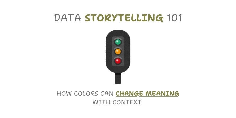
Red isn’t universally negative or associated with decrease, and green doesn’t always signify growth. Color interpretation depends on context and the viewer’s perspective. In this article, we’ll explore the importance of color selection when considering your audience. Misunderstandings can arise if color choices aren’t carefully considered.
Original article:
Foreword
What are the first thoughts that come to mind when you see the colors green, yellow, and red ?Imagine a traffic light — It uses three colors that work with how our brains naturally respond to color. When you see a red light, your brain automatically thinks “danger” or “warning,” which makes you want to stop right away. The yellow light makes you feel cautious and alert, telling you to slow down and be careful. Green feels safe and calming, letting you know it’s okay to go. These colors weren’t chosen by accident — they match the way our brains naturally react to colors, making traffic lights easy to understand and follow.
Example 1: Stock Price

Preview of NVIDIA Stock Price (Source: 2024 Yahoo. In partnership with ChartIQ)
Stock market charts use colors that match our emotional responses — green for price increases and red for decreases. This color choice isn’t random. When stock prices go up (shown in green), investors make money, creating positive feelings that match green’s association with growth and success. When prices fall (shown in red), investors lose money, triggering concern and caution — emotions we naturally associate with red. This color system helps traders and investors quickly understand market movements at a glance, just like how traffic lights use colors to guide drivers.
Example 2: Employee Attrition
In Human Resources, ‘Employee Attrition’ means when employees leave a company, whether they quit, are fired, retire, or move away. While it’s normal for some employees to leave, too much turnover can hurt the company by lowering productivity, damaging team morale, and slowing down business.

Department Wise Joinee/Resignee
When looking at the chart above, we use colors that tell a quick story. New hires are shown in green because they represent growth — it means the company is healthy enough to expand and bring in fresh talent. On the flip-side, resignations are shown in red because losing employees can disrupt work, affect team morale, and slow down business operations. Just like traffic lights or stock markets, these colors help HR managers quickly spot positive and concerning trends in their workforce.
Let’s look at this from another angle!
When tracking employee resignations, we need to flip our usual thinking about growth and colors. The KPI cards below show how many employees left the company and compare it with previous months.

Employee Attrition by Department (Image by Author)
In this case, more resignations (an increase) is actually bad news for the company, so we use red to show this growth. When fewer employees resign (a decrease), that’s good news, so we use green. It’s the opposite of how we usually think about growth in business — here, less is better!
Example 3: Survey Results
When conducting a survey, respondents typically choose whether they agree, remain neutral, or disagree with each question. The survey results can be visualized using different color schemes to represent these response categories.

Agreement with the Statement “I Define Myself as a Feminist”, by Selected Country (source: Ipsos)
There are standard color choices for indicating different levels of agreement that help users quickly understand information. Green is universally recognized as the color for agreement or positive responses, drawing from its association with “go” signals and success in various contexts. For neutral or middle-ground positions, gray or yellow are commonly employed, with gray suggesting impartiality and yellow indicating a cautionary “needs review” status. Red is consistently used to represent disagreement or negative responses, similar to its universal recognition as a stop or warning signal. This color scheme follows the familiar traffic light logic that most people intuitively understand.
FAQ
Which alternative color combinations can effectively indicate positive and negative trends in data visualization, while addressing the limitations of traditional red and green?
While red and green are commonly used to indicate positive and negative trends, alternative color combinations can be more effective in certain contexts. For instance, blue and orange offer a strong contrast and are accessible to colorblind individuals. Purple and yellow also provide clear distinction while being accessible. For a more subtle approach, varying shades of blue can be used to represent trends. It’s crucial to consider the target audience, cultural context, and viewing environment when selecting colors. To ensure clarity and accessibility, any alternative color scheme should be paired with additional visual cues like arrows or plus/minus symbols and meet appropriate contrast ratios.

KPI Cards Example (Image by Author)
The KPI cards above employ blue and orange, as well as purple and yellow color combinations to visualize monthly profit comparisons between years. In the month-to-month analysis, blue or purple columns indicate periods where the current year’s profit exceeds the previous year’s performance, representing positive trends. Conversely, orange or yellow columns signal periods where the current year’s profit falls below the previous year’s figures, highlighting negative trends. These color choices offer clear visual differentiation while maintaining accessibility for users with color vision deficiencies, making the profit trends immediately apparent and easy to interpret.
Conclusion
When selecting color schemes for data visualizations in reports or dashboards, several key factors should guide your decision. Consider your target audience’s potential visual impairments, cultural interpretations of different colors, the semantic meaning of your chosen colors, and the viewing environment where your visualizations will be displayed. This thoughtful approach to color selection ensures your data presentations remain both accessible and meaningful.
Should you have any inquiries, specific requests, or feedback, please feel free to contact me through LinkedIn or email.
The .pbix files for free-access content are on my GitHub repository.
/w=3840,quality=90,fit=scale-down)
